The aim of colour analysis is to identify the palette of colours that best harmonise with our natural features. The theory is that we look our healthiest, smoothest and brightest selves by wearing colours with qualities similar to the qualities of our natural colouring, whereas we may look dull, washed out or tired by wearing colours with contrasting qualities.
This article will cover the main approaches to colour analysis; the three colour qualities used in colour analysis; how these qualities are used to identify colour categories; DIY colour analysis methods vs professional colour analysis, and finally, the impact of understanding your colours.
the seasonal and tonal approaches to colour analysis
The idea that colour influences our appearance has existed for centuries, but colour analysis as it is known today entered mainstream culture in the 1970s after the bestselling book ‘Color Me Beautiful’ by Carole Jackson. This book popularised the four season system, where both colours and people were categorised by two qualities - temperature (cool vs warm), and value (dark vs light). Spring is characterised as light and warm; Autumn as warm and dark; Winter as dark and cool, and Summer as cool and light. Under this framework, a person with warm undertones and overall light colouring would harmonise best with the warm and light colours in the Spring palette.

Recognising that not everyone would fit neatly into four categories, the tonal approach to colour analysis emerged in the 1990s. This system adds a third colour quality, chroma (muted vs bright), to create six tonal categories - warm, cool, dark, light, muted and bright. A person is categorised by their dominant or most noticeable quality only, rather than categorising them by a combination of two qualities. For example, if a person had noticeably very light skin, hair and eyes, the seasonal system would categorise them as either a Spring or Summer depending on whether they had warm or cool undertones. In the tonal system, they would just be categorised as ‘light’, and stylistically could wear any light colours - both warm and cool, and both muted and bright, so long as the colours are light. This framework allows flexibility for people who have neutral undertones and/or medium depth.
Today, the four season and tonal approaches are often combined. The result is the 12 season system used by most professional colour analysts.
Spring is characterised as warm, light and bright, so is split into Warm Spring, Light Spring and Bright Spring.
Autumn is characterised as warm, dark and muted, so is split into Warm Autumn, Dark Autumn, and Muted Autumn.
Winter is characterised as cool, dark and bright, so is split into Cool Winter, Dark Winter and Bright Winter.
Summer is characterised as cool, light and muted, so is split into Cool Summer, Light Summer and Muted Summer.
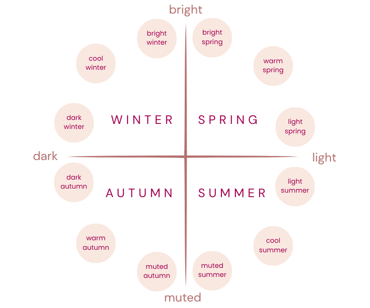
The dominant quality of the colours in a sub-season is the first word in the sub-season’s name, and the other two qualities of the parent season are present but less dominant. For example, while all Spring seasons contain warm, light and bright colours, the Bright Spring palette contains the brightest colours - they lean warm and light too, but are relatively cool and dark vs the Warm Spring and Light Spring colours (respectively). A person can be matched to a sub-season by identifying their dominant and secondary colour characteristics. For example, a person with noticeably vivid blue eyes and a warm leaning undertone would likely be best suited to the bright and warm colours in the Bright Spring palette. Expanding the seasons like this allows for all combinations of qualities across temperature, value and chroma to be represented by a season.
The warm and cool seasons are equivalent to the seasons in the four season model, and all others (bright, muted, light, dark) are called ‘flow’ seasons, because they represent where the qualities of each parent season blend. This means you can read the seasonal circle almost like a graph. For example, both Bright Winter and Bright Spring have a dominant quality of bright and contain the brightest colours, so they sit at the highest point on the muted to bright axis. Bright Winter leans cool and dark (because it is a Winter season) while Bright Spring leans warm and light (because it is a Spring season), but they are both more neutral on these qualities than the other Winter and Spring seasons - for example, the colours in Bright Winter are the lightest out of all Winters, and the colours in Bright Spring are the darkest of all Springs (which is why they sit close to the neutral position on the dark to light axis). As a result, Bright Winter and Bright Spring are actually quite similar, and represent where Winter flows into Spring and vice versa.
colour qualities explained
What do we actually mean by temperature, value and chroma, and how do these reflect in human colouring?
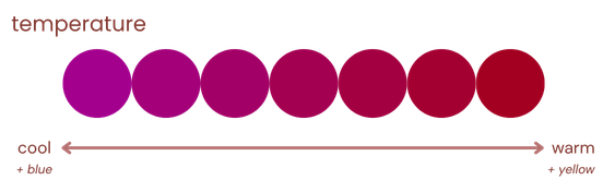
Temperature in colour theory means the amount of blue in the colour vs the amount of yellow. In humans, this translates to cool undertones and warm undertones.
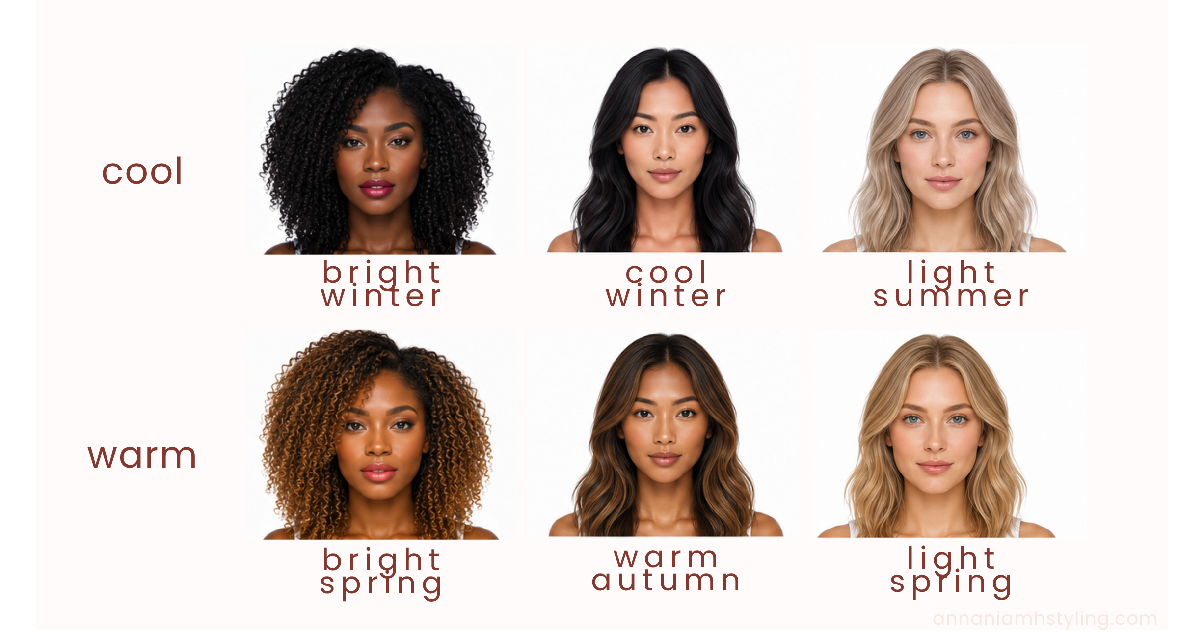
These AI generated images illustrate the difference between cool and warm undertones. The cool toned seasons are on the top row, with comparable warm season on the bottom row. The cool toned seasons appear ashy or rosy toned, and the warm seasons appear golden or honey toned.
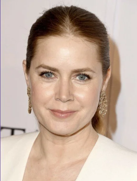
Seeing Emily Blunt (left) and Amy Adams (right) side-by-side helps to see the difference between cool and warm tones too. They have similar levels of depth/value, but Emily is a Cool Summer with rosy tones to her complexion and Amy is a Warm Spring with yellow tones.

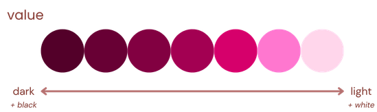
Value, or depth, is simply how light or dark a colour is, or how close the colour is to white or black.
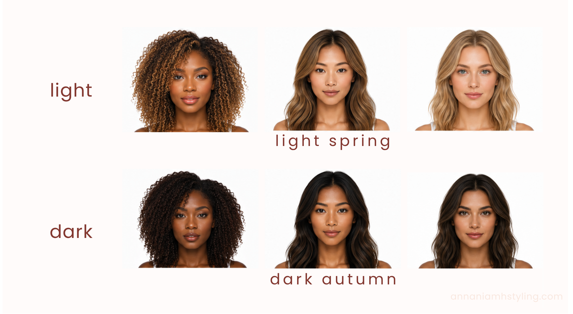
Our AI ladies here are light spring on the top row (light + warm), and dark autumn on the bottom row (dark + warm). You can see an overall light colouring across hair, eyes and skin for the top row images when compared to the bottom row, which have noticeably dark features.
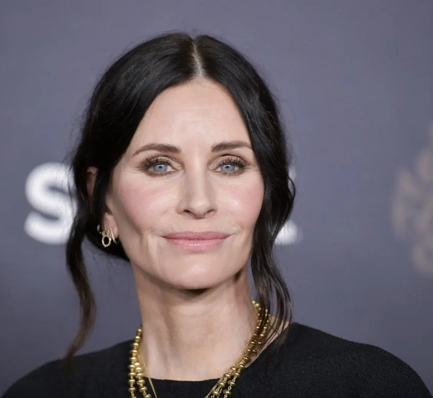
A good real life example can be seen by comparing Cate Blanchett (left), a Light Summer, to Courteney Cox (right), a Bright Winter. Both have very fair and cool skin, but Cate’s hair is strikingly light while Courteney’s is strikingly dark.

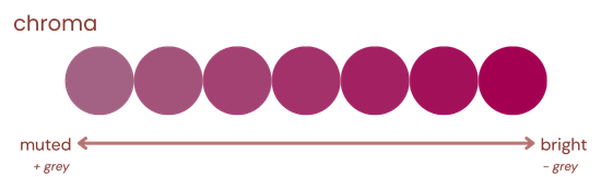
Finally, chroma refers to how saturated a colour is, or how much grey has been added to a colour to lessen its intensity. Colours with high chroma will look pure, vivid and bright, whereas colours with low chroma will look dusky, soft and muted.
Our AI ladies here are bright spring on the top row (bright + warm), and muted autumn on the bottom row (muted + warm). The bright spring images have a luminosity to them, whereas the muted autumn images have a more grounded quality.

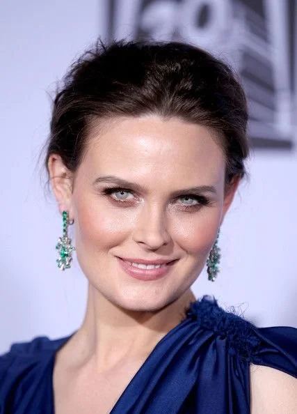
Emily Deschanel (left) and Alexandra Daddario (right) give a good real life example here. Both actors have similar natural colouring with cool undertones, but Emily is a Cool Summer (medium-low chroma) whereas Alexandra is a Bright Winter (high chroma). Emily’s overall appearance is softer and more blended, and her eyes are more of a grey-blue, whereas Alexandra has a more striking contrast between her dark hair and fair skin and her eyes are more of a vivid blue.

All colours can be made cooler, warmer, lighter, darker, more muted or brighter by adding blue, yellow, white, black or grey, or by removing grey, respectively. This means that regardless of season, there will be a version of every colour that falls within your palette and makes you glow!
It’s worth noting that all of these qualities are spectrums, and it is theoretically possible for a person to be exactly neutral across all three dimensions, meaning they would be able to wear colours from multiple seasonal palettes successfully and wouldn’t belong to just one. In reality though, everyone will have at least a slight pull in at least one direction.
identifying seasons from colour qualities
Finding your season (or tonal category) starts with understanding your colour qualities. There are two main ways to identify your colour qualities:
visually assessing your skin, hair and eyes
draping (or any method of directly observing the impact of different tones on your appearance).
The first approach is to assess your skin, hair and eyes against the three colour qualities: temperature (warm or cool), value (light or dark) and chroma (bright or muted). For example, your skin may have warm or cool undertones, your hair may appear golden or ashy, and your eyes may have a warm, golden quality or a cooler, icy appearance. Once you've considered all three features, identify your dominant quality - the characteristic that stands out most clearly across your colouring. This may be the easiest trait to recognise or the one that appears in at least two of the three areas. If your dominant quality is light, dark, bright or muted, your secondary quality will be warm or cool; if your dominant quality is warm or cool, your secondary quality will be bright or muted. You can then use these qualities to identify your sub-season using the table below.

The second approach is about physically placing items of different tones against your face and observing how your appearance changes. The most accurate way to do this is by using a professional colour analysis draping kit, which contains four different tones of each colour representing the four parent seasons. The effects of the drapes need to be observed in natural daylight and against natural skin which hasn’t been altered by makeup or fake tan. The most harmonious tones will make you look healthy and bright and will minimise any fine lines, shadows or marks, whereas the least harmonious tones will do the opposite.
You might ask how it is possible to identify which of the 12 sub-seasons a person sits in using only four different drapes for the four parent seasons. This is because each of the parent seasons has exactly one quality in common with each of the other seasons, and so if a client harmonises well with two seasons, their dominant colour quality is likely the common quality between those seasons. For example, if a client harmonised with Spring and Winter drapes, it is likely because their dominant colour quality is brightness, and so they would either be a Bright Spring or a Bright Winter depending on whether they had warm leaning undertones (Bright Spring) or cool leaning undertones (Bright Winter). Similarly, if they harmonised with Spring and Summer drapes, it would likely be because lightness is their dominant colour quality, placing them in Light Spring or Light Summer, or if they harmonised with Spring and Autumn, warmth is likely their dominant colour quality, placing them in Warm Spring or Warm Autumn.
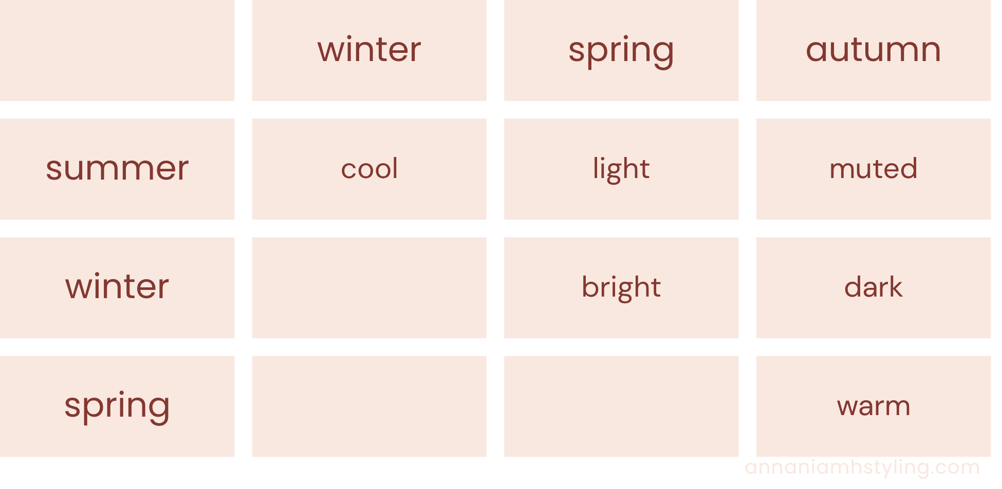
Draping tends to be more accurate than the first approach because it is actually testing the impact of the colours on your complexion, rather than relying on colour theory. Colour theory is accurate most of the time, but humans are varied and sometimes people defy the logic behind it, glowing in palettes they’re not logically ‘meant’ to. On the other hand, as they say in the London College of Style, the drapes never lie!
DIY vs professional colour analysis
ChatGPT and Claude can analyse your colours from a photo with reasonable success - I recently tested them against a professionally classed dataset and they gave the correct season for ~17% and ~22% of photos, respectively. The issue is that colour presents inconsistently in photos depending on the lighting at the time the photo was taken. Also, the models behind these tools are trained to provide the ‘safest’ response, so tend to be biased towards middle ground seasons such as muted summer and muted autumn.
There are also online questionnaires which claim to be able to tell your season, which are essentially asking for indications of the three qualities of colour and extracting a season from that. The issue with this is that it requires a good level of self-awareness to begin with. For example, some online questionnaires ask if you look better in gold or silver jewellery, which somewhat defeats the point of the analysis (to find out if gold or silver would suit you better…) but is also difficult to answer for anyone who sits in a flow season (light, dark, bright, muted). They can be useful, but they’re also a slight catch 22 - you need to know about your colour qualities (even if you don’t know that’s what you’re being asked about) to be able to get an accurate result.
It is possible to DIY the draping process with items of clothing or other fabrics you can find around the house, and there are lots of community forums with members supporting each other with second opinions. The accuracy, though, will definitely suffer - items around the house won’t have the accurate colouration that professional drapes do, and it does just take a while to train your eye to the impacts of harmonious and inharmonious colours. As a result, if you would like to DIY, I would recommend starting with the first approach - assessing your skin, hair and eyes for temperature, value and chroma, and using the table above to find your season. You can then use ChatGPT or Claude and online questionnaires to support if you get stuck.
The most accurate way to identify your colour season will always be with a professional - not only because of the professional draping kit, but for a professionally trained eye.
As a side note, I am working on a new DIY colour analysis tool which will hopefully go some of the way to overcoming the issues with existing DIY tools. Watch this space!
a note on season names
Confusingly, there are multiple names for the same seasons:
The warm and cool seasons are also known as ‘true’ seasons, e.g. Warm Autumn = True Autumn
The dark seasons are also known as ‘deep’ seasons, e.g. Dark Autumn = Deep Autumn
The muted seasons are also known as ‘soft’ seasons, e.g. Muted Autumn = Soft Autumn
The bright seasons are also known as ‘clear’ seasons, e.g. Bright Spring = Clear Spring
There is also a 16 season system. In the 12 season system, ‘warm’ and ‘cool’ are interchangeable with ‘true’, whereas in the 16 season system, they are separate and different - ‘true’ seasons have balanced weights across all three colour qualities and ‘warm/cool’ seasons have a dominant feature of temperature. For example, in the 16 season system, True Autumn would be equally warm as it is dark as it is muted, while Warm Autumn would have a dominant quality of warm and secondary qualities of dark and muted.
All of this means that different colour analysts may call the same season a different name, or call a different season the same name. Personally, I use the 12 season system with the names used in this article because I find them the most intuitive, but it’s worth being aware of the different naming conventions in case you want to cross-reference different resources.
THE IMPACT OF COLOUR ANALYSIS
Understanding the colours that enhance your appearance is one of the most practical tools you can have in building an effortless wardrobe. Colour analysis allows you to be more intentional in your shopping and informed in your styling decisions - saving money, boosting confidence and helping you to look and feel your best every day. If you’re ready to discover your season with a professional, I’d love to help!